At the broadest level, there are three, count ‘em, distinct schools of car design. Let’s take a look at them.
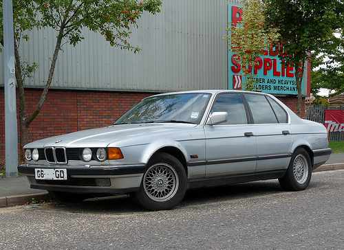
The First School of Car Design distinguishes itself with innocuous styling that endears to the lowest common denominator. That is, those for whom industrial design means designing a coal-burning power plant. This school of design is embraced by Lexus’ L-Finesse language, as exemplified by the Lexus RX350. This school is usually commercially successful due to its broad range of appeal, but enthusiasts lament this unemotive approach for its relentless pursuit of boredom. Spitefully, history will occasionally mock the design literate by viewing such designs as high style watermarks of understated style. Classic example: 1990 E32 BMW 7-series.
1990 BMW 735i
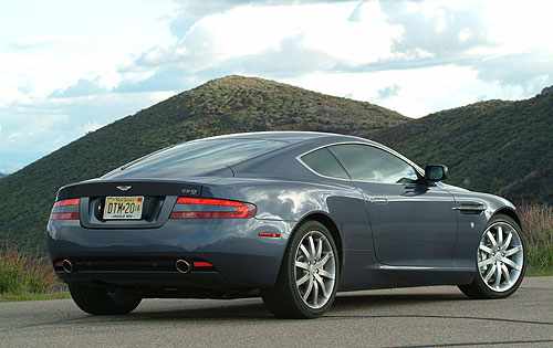
The Second School of car design is similarly timid, but goes a little further to please the aesthete. This school makes only the most utterly beautiful cars, but they are conventionally so. Little ventured, little gained. Classic example: 2004 Aston Martin DB9.
2007 Aston Martin DB9
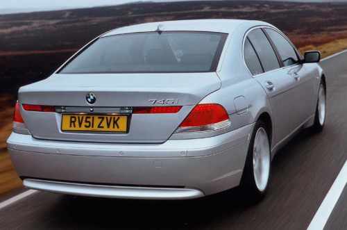
The Third School of car design is more brazen, and therefore my personal favourite; it goes for gasps rather than sighs and generally polarizes opinions into one of two camps: Love and Loathe. This school can also be commercially successful, but it is blue rare for this to be the case. Chris Bangle’s endlessly controversial 2002 E65 7-series is one of the few examples where the vitriol spewed across the pages of the web were at odds with a vehicle that sold better than anyone could’ve expected. In fact, the E65 was the best selling 7-series ever.
2004 BMW 745i featuring the Bangle Butt.
I enjoy a classically beautiful product of the Second School just as much as the next gearhead, but I also enjoy a challenging design – one that has to be masticated, catabolized, and digested before it can be fully grasped. There’s nothing in the automotive realm quite as rewarding as abhorring what initially appears to be a weak design… and then slowly, even reluctantly, picking it apart, angle by angle, and coming to an entirely new conclusion. When this happens for me, it’s as if my unconscious, impulsive, thin-slicing processes were mistaken and my methodical, conscious brain had to kick in to reveal the admittedly subjective truth. It’s these complex, almost human, relationships with cars that are the most enduring and deeply gratifying as an enthusiast.
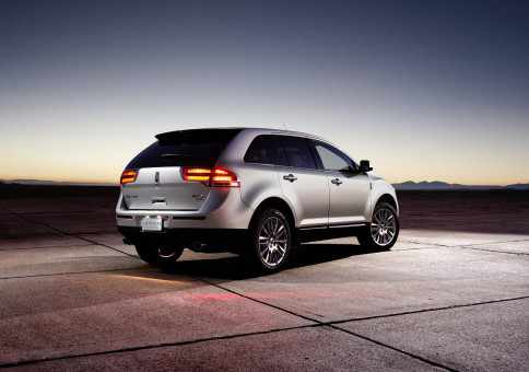
There’s little doubt that the MKX is a shining example of the Third School. With its Art Deco references, the 2011 MKX reaches deep down into the recesses of its historical archives and pulls out design elements that fall firmly into this most defiant of categories.
With its imposing waterfall grille taking much of the brunt of automotive “journalists” and the chattering classes, the MKX’s Art Deco cues seem to be lost to the world. Not that I can really blame them, unless they live in Chicago and have the context that most of us lack. But it’s bewildering that the brand’s marketers don’t get it either.
All of which brings me neatly to my first experience with the squared-off crosshairs. This, then, was to be a formative branding event – the culmination of the Lincoln marketer’s space-age fantasy crashing head first into 6 days and hundreds of kilometers of urbanite exploitations. The MKX would also provide me with answers to some questions raised by the marketing dept such as
“Is the white-haired dude from The Adjustment Bureau going to tell me that driving the MKX is part of The Plan?”, and
“What does the debate between determinism and free will have to do with the MKX anyways?”
The questions were endless.
Once the keys were in hand, I started probing the design, marketing, and big picture questions first. (Driving impressions will be in Part 2).
More controversial than Obama. Almost.
Having debuted in 2007, the MKX has been significantly redesigned for the 2011 model year. Shedding the original model’s solid bar taillights that stretched the rear’s width, the new model has a more mature taillight design that eschews the 1930’s look for intricate, yet less decorative, units. At the front, the 2007’s baby Navigator grille has softened around the edges and simultaneously grown 2 sizes.
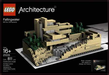
Harsher critics have brought up comparisons between the new grille and the filter-feeding mouths of the suborder Mysticeti, who sift plankton between their comb-like teeth; but to my eye, a closer comparison would be Frank Lloyd Wright’s 1935 Fallingwater, of which I want the Lego model very badly.
My birthday is June 23. Just in case you care.
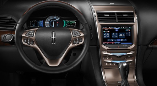
Popping inside, the interior has shed the 07’s truckish simplicity for a more upscale and cohesive appearance. Like the taillights, the interior has lost some of the Art Deco angularity in favour of a softer, more contemporary functionality. MyLincolnTouch plays lead in the new interior, but the supporting cast of switches, dials, and surfaces are equally noteworthy in their refinement. As a bonus, the new heated steering wheel wasn’t robbed from an F-150. It’s now handsomely triangular and littered with buttons that fall readily into your hands if you’re holding the wheel at 4 and 8 o’clock, which is awkward. Nearly as awkward and infinitely more pointless is the electrically telescoping steering wheel that dances a merry jig every time the car is turned on and off. Ok, it’s not entirely pointless, it does serve to let you know when you’ve successfully turned the car off. There’s really no other way. At idle, the engine is silent whether the MKX is on or off, and the stereo system stays on until you’ve opened the door. Still, it doesn’t make the car feel fancier and more expensive, it just wears out a motor.
The 2011 model’s glitz and glamour.
The new interior is certainly more upscale in its execution and offers enough tech to blind a bat, but it also ends up feeling a bit more generic in the process. The problem with genericism is that it lends itself more easily to comparison. No easy task when the competition is the Lexus RX350.
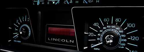
The 2007 model’s retro-infused gauges.
Inevitably, comparisons to the aforementioned Lexus RX350, the founder and leader of the luxury crossover segment, will be drawn. So is the American up to snuff? The build quality isn’t quite at Lexus levels but the overall aesthetic is just as pleasing, if not better. Front and centre in the war for hearts and minds is the new twin-screen gauge display. The original MKX’s squared gauges weren’t nearly as capable as the new twin-screen piece, but they looked so damn cool that you could forgive them. The new twin-screens also look the part, albeit a more cutting edge one, and provide an awesome amount of customization for the toy-driven boy, with a swiftness and slickness that the central dash unit would kill for.
The centre dash’s MyTouch system feels like it needs about 2GB more RAM. It’s just a bit laggy and doesn’t zip from task to task as quickly as necessary. The SYNC voice control system, however, works magically well and recognizes names from my Bluetooth-syned iPhone 4 every time. This made my calls hands-free, and therefore legal for the foreseeable future, but it really doesn’t change how safe talking and driving is. Still, I have yet to use a system that worked with my iPhone 4 so brilliantly. I could even wirelessly stream music via the Bluetooth connection to the stunningly wicked THX speakers!
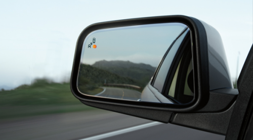
Other technologies, such as the Blind Spot Information System, work exactly the way you’d expect the first time you use them. The learning curve isn’t steep, it’s flat. Just take a peek at your side-view mirror, and watch out for the orange indicator light in the corner. Easy peasy. The rear-view camera is similarly useful.
So the Lincoln offers more inside than the Lexus, but then there’s also the matter of Ford. The problem is that the Ford Edge does all the same tricks for $6,000 less. Stylistically, the Edge also has a wider appeal, making for a deadly one-two. That’s the thing about Lincoln right now; dangerously little differentiates them from their Ford counterparts. There are whispers that this is set to change, but it frankly can’t come soon enough.
I understand that component sharing is a necessary evil of mass production because it provides the economies of scale necessary to spread out development costs, but poor brand differentiation seems to be anchoring Lincoln to the 2nd tier of the luxury market. That, and the fact that the Ford equivalents are so incredibly accomplished already that there’s little reason to pony up for the Lincoln badge. Unless you happen to like the looks, which I do, but most don’t.
But that’s enough for today. In the coming days we will step away from the design and marketing, and delve into the driving experience. See you then.
Photo credits: © Andrew/Flickr, On The Road, Ford, Lincoln


